I was given various feedback on the research and planning aspect of my coursework and I found a number of things. I need to go over my previous work and add media terminology to my work to make it more detailed and also add more information about how all my analysis will effect my product and my ideas. I need to relate the information I found more to my products so that my final product will reflect my research.
I also need to develop more audience research discussion and hopefully create an audience profile for my magazine which will include quotes from my audience feedback. I am also going to add more information to my article research.
Wednesday, 22 February 2012
Monday, 20 February 2012
Progress Update
There are 6 weeks until the Easter break which means - 6 weeks of lesson time to complete my foundation portfolio.
There are 60 marks available for construction and 20 marks for Research and Planning and 20 marks for evaluation - 100 marks in total
To achieve a grade:
A I need to get 80 marks
B I need to get 70 marks
C I need to get 60 marks
To be in level 4 (grade A/B) my work must demonstrate excellence throughout.
I am aiming for at least a grade B which means I need to get 70 marks for my overall product which includes the construction, research and planning and then my evaluation. I am aiming to have a rough cut of my products by the 5th March and to have most of my photography completed by the 24th of february. I am going to begin creating the outline of my products on Photoshop and InDesign now so that when I have done my photography they will be finished already.
Friday, 10 February 2012
Model Call Sheets
Shown below are the call sheets for my models that will be featuring in my magazine. They show the shooting date, the location and their role in the photo shoot. It enables me to know that they have their model release forms signed which allow me to have permission to use them in my photography which will be printed and published online
Model: Beth Turner
Character: Photography Model
Release Form Signed: Yes
Shooting day: 20/2/12
Location: Darlington
Producer: Lauren Barden
Director: Lauren Barden
Model: Rebecca Humphrey
Model: Beth Turner
Character: Photography Model
Release Form Signed: Yes
Shooting day: 20/2/12
Location: Darlington
Producer: Lauren Barden
Director: Lauren Barden
Model: Rebecca Humphrey
Character: Photography Model
Release Form Signed: Yes
Shooting day: 20/2/12
Location: Darlington
Producer: Lauren Barden
Director: Lauren Barden
Model: Gemma Gowling
Character: Photography Model
Release Form Signed: Yes
Shooting day: 20/2/12
Location: Darlington
Producer: Lauren Barden
Director: Lauren Barden
Model: Thomas Heath
Character: Photography Model
Release Form Signed: Yes
Shooting day: 20/2/12
Location: Darlington
Producer: Lauren Barden
Director: Lauren Barden
Test Shots


Thursday, 9 February 2012
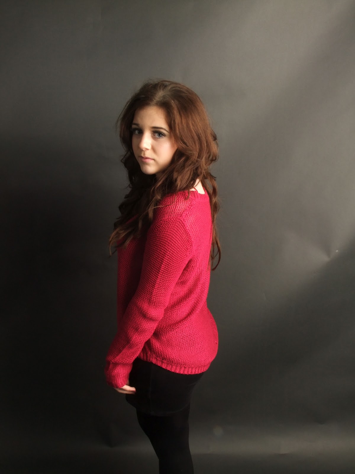
Evidence Of Costume Organisation
This is the style of outfit that my cover model will be wearing:
 I have chosen an outfit like this as I feel that it represents the type of artist on the cover. It is very feminine as shown by the pink and the sparkles matching to the pop artist on the cover, however it is also not plain, the sparkles on the top of the dress are quite bold and will catch the readers eye which is something that I aim for. It again targets the female audience I want quite well however it will also be appealing to males as they may find the model attractive in this outfit and it will catch their attention therefore making them want to buy the magazine and read about the artist. It will also fit with the colour scheme on the page of white and blank, it will stand out and look visually interesting to the reader. I feel this outfit will also match the glamorous style of the artist and represent her well. The make up and hair styling of this model will be matching the femininity of the outfit, very soft and quite natural with feminine colours used like pink.
 This is the style of shirt that the male model will be wearing on my contents page, he is only going to be shown from a mid shot so the reader won't be able to see the rest of his outfit. I chose this shirt as I feel it is quite mainstream and simple, matching the artists house music genre which isn't overly theatrical, mostly focusing on music so I want this artist to be styled to represent that well.
 This is the dress that my model on my contents page will be wearing. I have chosen an outfit like this as it will contrast well with the simple colour scheme that is on that page of black and white. It also makes the artist again seem very feminine however not completely as the red adds excitement to the artist matching the type of dramatic artist that she is. It suggests to the reader that the artist has somewhat of an edge about her and is very theatrical and enjoys big performances. The sparkles on the dress will also entice the reader as it will stand out on the page. The model's make up will consist of quite dark eyes and red lips, again to reduce the artist looking too sweet and girly. This will appeal to the male readers as well as female readers because of the sexuality of the styling.
 This is the outfit that will be appearing on my double page spread. I chose this as it works well with the femininity of the pose that my model will be doing and it also works well with the colour scheme on the page. It matches the artists feminine pop style of music that she produces. This style of music will make the artist look very graceful and not overly theatrical which is what I want as I want her to be a role model to the younger readers. The styling of hair and make up will stand out a bit more because of the simpleness of the outfit, eye make up will quite heavy so that they stand out and the artist doesn't look too boring and hair will be quite big and will be curled
I have chosen an outfit like this as I feel that it represents the type of artist on the cover. It is very feminine as shown by the pink and the sparkles matching to the pop artist on the cover, however it is also not plain, the sparkles on the top of the dress are quite bold and will catch the readers eye which is something that I aim for. It again targets the female audience I want quite well however it will also be appealing to males as they may find the model attractive in this outfit and it will catch their attention therefore making them want to buy the magazine and read about the artist. It will also fit with the colour scheme on the page of white and blank, it will stand out and look visually interesting to the reader. I feel this outfit will also match the glamorous style of the artist and represent her well. The make up and hair styling of this model will be matching the femininity of the outfit, very soft and quite natural with feminine colours used like pink. 


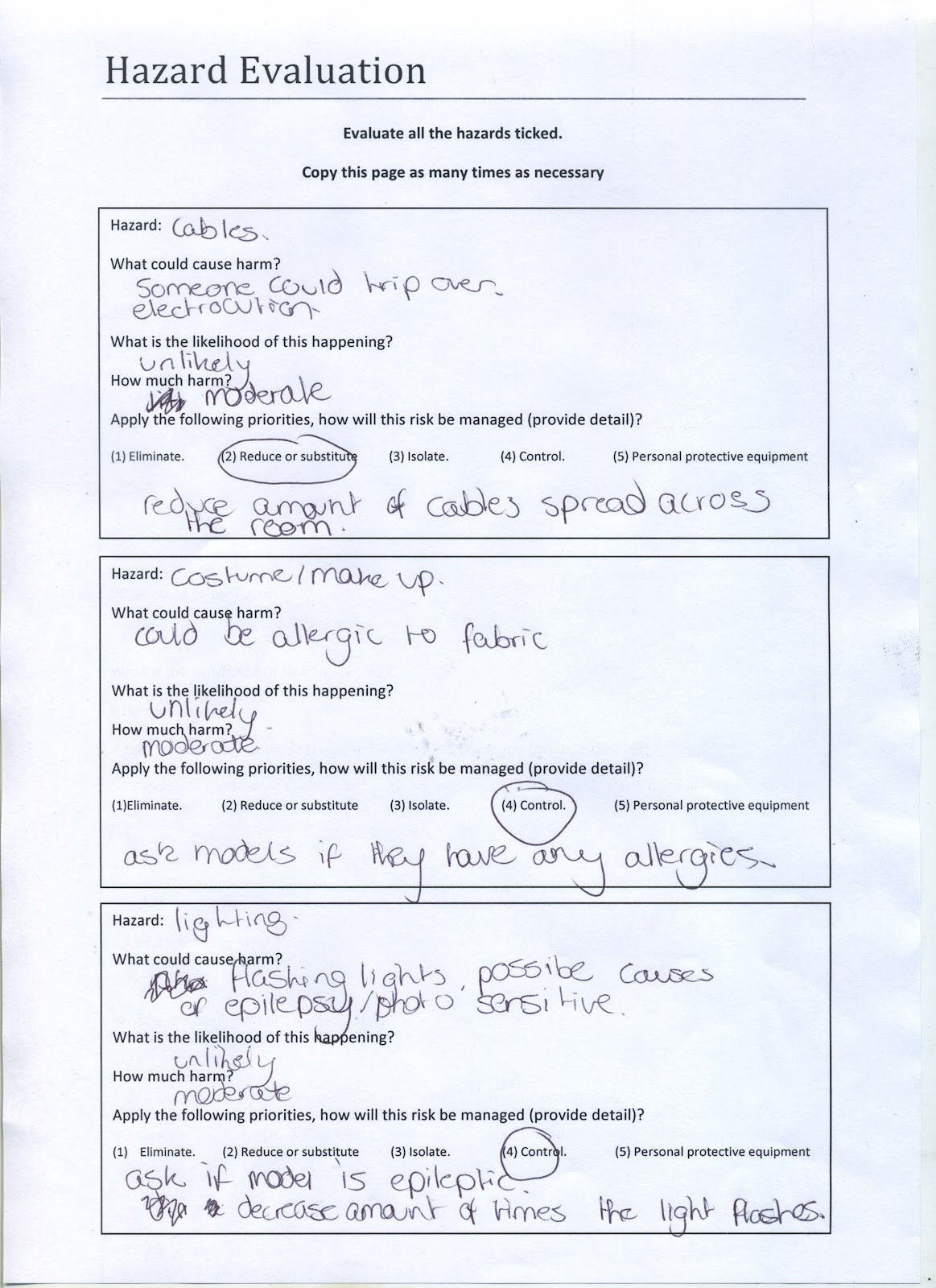
Risk And Hazard Assessments

Wednesday, 8 February 2012
Recce Of Location

It is generally a safe and hazard free environment which will enable me to work well within the photoshop and be aware of the safety of myself and my models. This location also enables me to shoot with a white background which is the background I want for a large portion of my magazines. It is a very easy accessible
Monday, 6 February 2012
Planning An Article
The article which will be featured in my double page spread is going to be about a female pop solo artist. It is going to be written in the style of an interview about their experience of rising up the music charts. To start with there will be a brief introduction of the artist and their role in the music industry which will be written in the third person as it is just a general overview, as the interview is then shown the narrative will change to first person, the initials of the magazine will be in bold before the interviewers question and the artists response will be shown with their initials also in bold followed by their answer. I am choosing to do this as I feel as though it makes the artist seem much more relatable and approachable to the reader as they are seeing responses from the artist themselves. It is going to feature quite friendly and informal language as I again feel that this will make the artist seem much more approachable to the reader and as my magazine is aimed at a younger target audience I want it to be in the style of language that would be most suitable for them. I also want the interview to be quite fun and quirky as I want to match the article to the pop genre of my magazine, there would be no point in having quite blunt language seen in magazines such as NME which represent the rock genre for my pop magazine. There is going to be music industry related topics in the article such as the artists upcoming tour, how the found the recording experience and how they are promoting their album for example visiting different countries and going on radio tours.
The introductory paragraph is going to be quite a dramatic overview of the artist explaining how this is an exclusive interview with a bright new artist and how they are establishing themselves in the music industry. This makes the content of the article seem like a must read to the reader, they want to learn more first about the artist before anyone else as it is described as an exclusive and audiences typically enjoy knowing about huge upcoming artists before everyone else.
Some extra text that will be featured on the page is going to be quotes around the page from the artist themselves representing the type of person they are. I am doing this again to make the artist seem approachable to the reader in order to gain support and fan loyalty for the artist. Their will also be links to the artists twitter and facebook page, again another way of making fans loyal to the artist and want to follow what they are doing in the music industry and to gain news of upcoming tour dates and promotion events.
Friday, 3 February 2012
Article Research
The Muppets:
The way this article is written is the format of an interview, and the type of introduction used in this article is a summary introduction, which shows a brief introduction to what the article is about, it is quite formal and comical language which to the reader shows what type of characters The Muppets are, very humorous and fun. The format of an interview used here represents who the article is about as much more approachable, it allows the reader to feel much closer to those in the article and are therefore more interested in what they have to say.
Muse Article:
This article is written in first person as the article itself is about what the journalist is trying to achieve although the article is about Muse. This format gets across the journalists point of view better as it is his own opinion. The introduction here is also a summary introduction however it is much more different to the Muppet's article, it is not actually discussing Muse themselves it is again more about what the journalist is trying to achieve here.
You Me At Six Article:
This article is written in a third person narrative as it is a general overview of the band therefore allowing the reader to interpret the article however they want. The introduction shown is not only a very brief summary of the band it is also an anecdote introduction, this is when it uses a short account of some interesting or humorous experience to get the reader interested. This also relates to the type of artists that You Me At Six are, renowned for being quite fun and mischievous.
Thursday, 2 February 2012
Image and Construction Analysis

This shot of Kelly Rowland could be used on a front cover as there is room for a masthead and sell lines over her image. Her eyeline is quite a bit higher than the rule of thirds suggesting that she has power and dominance, also she is looking directly into the camera therefore addressing the audience. Her outfit is very sexual because of the leather, therefore suggesting the type of artist that she is, she is a very feminine and sexual artist also relating to the type of music she produces. She also has a very sullen face and is pouting at the camera again emphasising the type of sexual appearance that she wants to come across therefore appealing to males that find her attractive and will therefore want to buy her music. One of her eyes is partially covered, this makes her seem quite mysterious in the image and although it doesn't make her seem very approachable it represents her music well and the type of artist that she is. The lighting is quite dark again emphasising the idea that she wants to come across as quite mysterious and sexual to the reader. Her dominance is also suggested to the reader with the leather outfit she is wearing and also that she is shot from a low angle it again makes her look more dominant towards the reader as they are looking up at her when they see this image.

This image could be seen as a double page spread as it would generally be too wide to fit on a front cover. It is a very simple shot and all the boys in the group are shot on a similar rule of thirds despite their height suggesting that all the members are equal to the reader. This is also emphasised by the fact that they are generally wearing similar outfits, all very dark outfits and similar style of clothes. Although two members of the group are shot closer up this could be because they are either more well known and recognised by audiences or for the simple fact that they all had to fit on the page this way. They are all showing similar facial expressions and body language, they aren't appearing particularly dominant to the reader as they aren't shot from a low angle however as they are looking directly into the camera they are therefore addressing the reader. This could be done to make the boys seem more down to earth and approachable, trying to gain fan loyalty. Their facial expressions look quite sullen making the boys seem very mysterious but also show their sex appeal, which would be done to gain female fans who find them attractive and would therefore want to buy their music. The dark lighting again emphasises their mysterious element, signifying their sex appeal. It doesn't particularly represent their genre of music (pop) however as there is no instruments shown for the band and they all look relatively mainstream this suggests to the reader that the group are unlikely to be of a rock genre, they have been represented as a typical boyband through their outfits and styling.
This has influence my photography as I now know I need to take into account things such as the rule of thirds, in order to make my model on the front cover seem more dominant I am going to shoot them higher than the rule of thirds but I also want them to be looking straight into the camera therefore directly addressing the reader. On my front cover I also want clothing that shows them as a chart artist, something quite mainstream but also shows them as being quite quirky and feminine as this is the type of artist I want to show on my front cover. Also I want quite bright lighting so that the artist seems much more approachable to the reader rather than mysterious, I feel this would also represent the pop artist I am going to depict my model to be. However I want their facial expression to be quite mysterious as I feel that this has a much better effect on the reader rather than a simple friendly expression which I feel could be quite boring. On my double page spread I again want the artist to seem quite mysterious although it is a different artist. The clothing is again going to be quite feminine and quirky to represent the artists pop genre. Their actual body is going to be facing away from the camera but their head is going to be slightly turned so that you can still see their eye level and they can be directly addressing the reader. They will be shot generally on the rule of thirds again so that they seem more approachable to the reader, yet they still look quite mysterious through the use of their body being turned away. The lighting is again going to be quite bright to represent the pop genre my artist is representing.
Wednesday, 1 February 2012
Feedback On Flat Plans
Front cover:
The feedback I received on my front cover generally tells me that the three people who commented on my flat plan liked the cover on a whole, particularly the main image as they felt it was simple yet interesting to look at and that it fills the page well. I also found that they thought the simple masthead works well on the front cover, that it fits the genre of the magazine I am creating well. Also I found that the main image title works well as it is visually interesting to look at and again fits well with the genre of my magazine. I found that my layout does appear very simple, however one criticism I received was the front cover itself was too cluttered, this therefore tells me that perhaps I should remove some of the sell lines in order to make more room on the page and make it easier for the audience to read.
Contents Page:
The feedback that I was given on my contents page generally tells me that the images were well liked as they filled up the page and made it look more interesting. I was told that the page on a whole was simple and distinctive which was the look I was going for when designing my contents page. I also found that those analysing my contents page found that it was clear and organised, very easy to understand. It shows the information of my contents clearly.
Double Page Spread:
The feedback I generally received on my double page spread is that the layout worked very well for my magazine, it fits the genre well and is very simplistic yet still eye catching. I also found that those analysing my magazine felt that the bold font made the page look interesting and stylish as it catches the readers eye. The layout was also clear for my audience to understand, it wasn't cluttered it was organised and spacious. They also felt the title worked well on the page and caught the readers eye.
Subscribe to:
Posts (Atom)